In this course, Chaz Chumley takes you through the process of transitioning a Drupal website to a responsive model that automatically tailors and sizes content for a wide range of displays, from desktops to mobile devices. The course starts with setting up the Drupal environment in Acquia and defines some basic principles of responsive design before moving on to creating a new Drupal theme with fluid layouts, fluid media, and responsive tables and forms. Chaz also covers writing media queries, which allow you to create different style sheets for each device type. The course wraps up with a look at Respond.js and content-aware image sizing in Drupal—responsive design tools that can optimize your project for maximum performance.
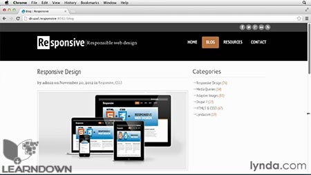
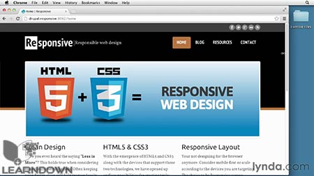
Topics include Drupal Responsive Design:
- What is responsive design?
- Understanding fixed-width vs. fluid layouts
- Working with fluid margins and padding
- Writing a media query
- Creating responsive menus and forms
- Adding min- and max-width support with Respond.js





Leave a Reply